Color Confidence: Easy Ways to Mix Hues Like a Pro
Unlock color confidence with easy, foolproof formulas and pro tips to mix hues, balance saturation, and build outfits that pop—every day.
Color Theory, Simplified
Color gets easier when you break it into a few friendly ideas. Start with hue (the color family), value (light to dark), and saturation (soft to vivid). On a color wheel, complementary hues sit opposite and create sharp contrast, while analogous hues sit side by side and blend harmoniously. A triadic set forms a lively trio spaced evenly around the wheel. In outfits, contrast draws the eye; harmony smooths transitions. A crisp blazer over a bright top works because the blazer adds structure and lowers saturation, helping the color pop without shouting. Try building outfits by choosing one statement hue and setting it against grounded pieces. Mind the temperature too: warm hues feel energetic; cool hues read calm. If you feel stuck, experiment with value shifts instead of more color—light denim with a deep sweater instantly adds dimension. With a few of these basics, you can dial outfits from subtle to striking while staying intentional and polished.
Neutrals First
Think of neutrals as your wearable canvas. Black, white, gray, navy, camel, olive, and denim-friendly blues pair with nearly any hue. Warm neutrals like camel or cream soften brights; cool neutrals like charcoal or ink add sleek clarity. Start with one to two neutral pillars—tailored trousers, a clean tee, a structured coat—and layer color thoughtfully. A monochrome base in mixed textures (matte knit, smooth poplin, brushed wool) creates depth even before you add a hue. Adjust value to fine-tune mood: light on light feels airy; dark on dark feels refined. If you crave gentle color but fear clashing, swap a stark neutral for a tinted one, such as dusty olive instead of flat gray. Accessories in leather, canvas, or satin introduce subtle shine or softness that shifts the overall read. With a neutral backbone, you can rotate accents freely, scale up or down contrast, and stretch every piece across weekday, weekend, and special plans.
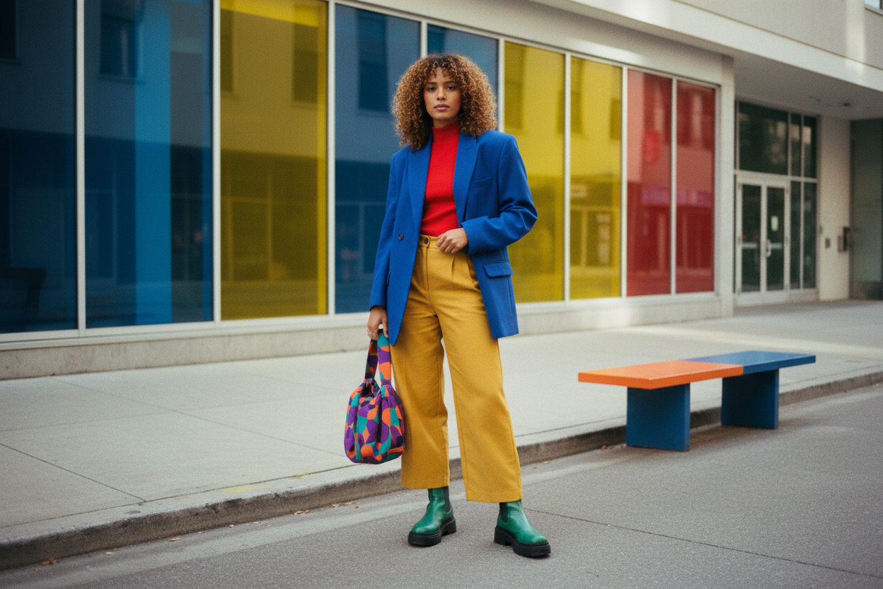
Bold Yet Balanced
Vivid pieces look sophisticated when you manage proportion and saturation. Use the 60-30-10 approach: about sixty percent base, thirty percent support, ten percent accent. A saturated skirt becomes effortless with a neutral knit and a small pop in a bag or shoes. Pair high-saturation hues with softened partners so one leads and the other follows. Complementary pairings feel dynamic; temper them with space—think a stripe, a belt, or visible layering that lets the eye rest. Analogous stacks are gentler; layer neighboring hues from light to dark for a sleek gradient. When in doubt, bring brightness near the face if it flatters your undertone, and keep the rest grounded. You can also echo a bold color twice in small hits, like earrings and a trim, to make it read intentional. Practice with accessories first, then move to outerwear or tailoring. Over time, bold becomes your new neutral.
Patterns And Texture
Prints and finishes can act like color while staying repeatable and chic. Treat classic stripes, micro checks, and subtle dots as near-neutrals; they mix easily with solids and other patterns. Balance scale when mixing prints—pair one larger, spaced pattern with a tighter, smaller one so they do not compete. Unify them with a shared color or similar value. Use texture to add intrigue without crowding the palette: ribbed knits, crisp poplin, smooth silk, rugged denim, soft suede, or sleek leather alter how color appears and catches light. Finishes matter too; matte mutes saturation, while satin, gloss, and gentle metallics amplify it. If a look feels busy, introduce negative space with a solid layer, clean belt, or minimal shoe. Keep pattern count to two or three and let one lead. This approach turns print mixing from risky to reliable, giving you dimension while preserving balance and polish.
Personal Palette
Your best colors start with your undertone—warm, cool, or neutral—and how value and saturation play against your features. Warm undertones love golden, earthy, or sunlit hues; cool undertones shine in crisp, blue-based shades; neutrals flex both ways. Place color near the face where it matters most: scarves, tops, blazers, or earrings. If a dazzling shade overwhelms you, lower saturation or shift value; a softened version can look just as radiant. Consider occasion and vibe too—low-contrast blends feel relaxed; high-contrast pairings read sharp. Build a compact capsule: two to three go-to neutrals, one to two supporting hues, and a couple of accents. Test outfits in natural light, snap quick photos, and note what feels energized and effortless. Over time, you will see patterns that guide smart additions. Confidence grows with repetition: refine, repeat, and rotate. With a clear palette and thoughtful styling, color becomes a tool, not a test.